Cardiology Wayfinding Redesign
May 2023


Solution
Product Overview
We designed a comprehensive wayfinding system to help staff and patients navigate CHOP's Pediatric Cardiology department more effectively. The system focused on four key design elements:
Waiting Room Themes
A colorful and fun redecoration of the waiting room spaces, to clarify the separate testing and provider waiting areas to reduce confusion.
.png)
Hallway + Check-Out Signage Designs
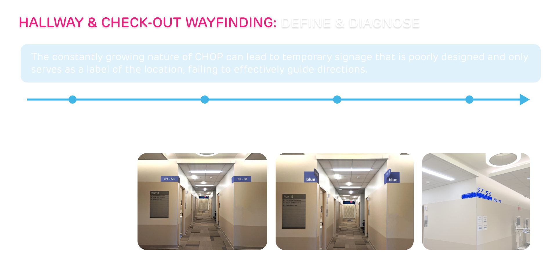
Signs which display the room numbers, hallway colors, and check out direction in addition to a massive check-out sign. These allow for quick identification of target destinations.
.png)
MyCHOP App Features
A system which shows the progression of a patient's appointment schedule. This allows patients to see the current queue time and wait time, so they can appropriately make informed decisions regarding staying in the waiting room.

MyCHOP Band
A printable QR Code given to patients and are scanned every time a patient begins or finishes a test. This system automatically updates patient status and also allows patients to see their progress through the previous solution of the MyCHOP app.
%2520(1).png)
but why?
but why?
Discover
Our Research
My Research
Over the span of two weeks, the team observed staff and patients in the cardiology department. We specifically focused on the flow of people as well as the moments of confusion, such as when someone would stop to ask for help in looking for something. Additionally, we interviewed at least one members from each team and specialty within the department. From this, we identified 6 major reoccurring issues:
.png)
We found that...
What I Found
The Cardiology department sees up to 80 patients a day. 80 patients may not seem much, but when you take into consideration that a single cardiology test/exam may take more than an hour to complete and that a single patient may have to complete multiple tests, you soon realize that 80 patients is a momentous task to see within a normal workday. With medical personnel overworked and understaffed, short delays are major issues and with hour+ long exams for 80 patients, each delay significantly adds up. Below are some of the issues we identified.
.png)
.png)
.png)
.png)
Define
But why?
So How Might we...
How might we navigate patients and staff to be in the right place at the right time?
Design Requirements
Develop
Ideating
We generated several ideas, from reimagining the waiting rooms to implementing patient tracking solutions. With input from the client, we narrowed our focus to waiting area themes, hallway signage, and check-out indicators, and added a patient tracking system with the MyCHOP app and band.


Design Feedback
Prototyping
I developed wireframes and high-fidelity prototypes for the waiting room themes and signage, which we quickly implemented for testing. Additionally, we prototyped the MyCHOP Band for patient tracking, syncing it with the MyCHOP app to provide real-time status updates.


Deliver
Testing
We tested our prototypes for an entire week at the Cardiology Department. The waiting area themes and signage reduced confusion, while the MyCHOP Band and app provided valuable real-time progress tracking for both staff and patients.

.png)
User Feedback
Based on continuous feedback, we refined the signage for better visibility and updated the MyCHOP Band to be more user-friendly for both patients and staff.
Final Iteration
By implementing clearer signage, distinct waiting areas, and the MyCHOP Band, we improved both staff workflow and patient experience. Our solutions significantly reduced delays and confusion, ensuring that patients and staff could navigate the department with ease and efficiency.


